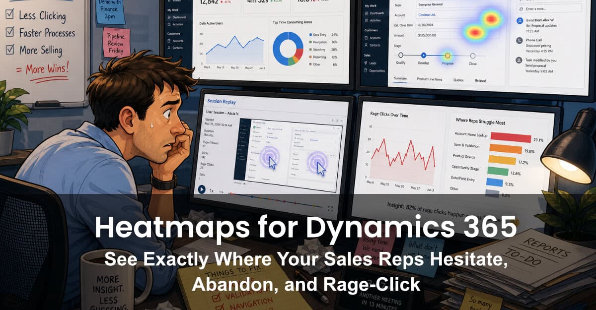
Ask a sales operations leader where reps lose time inside Dynamics 365, and you'll usually get a confident answer based on… not much. Maybe a Slack thread. A few help-desk tickets. A gut feel after one demo. The truth — the click-by-click truth of what your reps actually do, hesitate over, and abandon — has been almost impossible to see inside Dynamics. Until now.
Behavioral heatmaps and session replays are standard tooling for understanding behavior on public websites. They've never been practical inside a CRM. Microsoft Clarity changed the economics of behavioral analytics for the open web, but it still couldn't be installed inside Dynamics 365. Clarity Connect 365 by VisualSP closes that gap — and once it's running, the picture of what your reps are doing all day looks very different from the story your CRM dashboards tell.
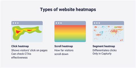
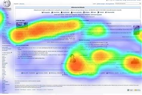
A heatmap is a visualization layered on top of a real Dynamics page that shows where users click, scroll, and hover — aggregated across hundreds of sessions. There are several flavors, and inside Dynamics 365 each one tells you something different:
That last category is where the magic is. Microsoft introduced dedicated rage-click and dead-click heatmaps in Clarity in 2022, and the signal quality is genuinely high: a rage click on a save button isn't ambiguous. Either the button is broken, slow, or unclear — and it's costing your reps real time on every record.

When teams enable Clarity Connect 365 inside Dynamics for the first time, the same patterns surface again and again:
None of these are exotic problems. They're the kind of friction that's been embedded in your CRM for years, invisibly draining a few minutes off every record. The reason they've persisted is straightforward: nobody could see them.
The most common question we hear is "Why can't I just install Clarity directly?" Two reasons.
First, Dynamics 365 is a single-page application with a restricted DOM. The standard Clarity script — which is built for static, multi-page websites — doesn't have the access it needs to capture meaningful heatmaps inside model-driven apps. Industry write-ups consistently note that Clarity can't be natively embedded in Dynamics; manual workarounds using HTML web resources or PCF controls are partial at best.
Second, even if you can get the script running, your security team almost certainly has policies that block third-party scripts inside enterprise tenants. That review process can stretch into months.
Clarity Connect 365 sidesteps both problems. For Dynamics 365 CRM and Business Central, deployment uses an admin-managed installation package — controlled rollout, no custom code, no bespoke security review. For Finance & Operations and other variants, a managed browser extension does the same job. As a third-party industry analysis put it bluntly: VisualSP currently offers the only plug-and-play integration that lets Clarity run seamlessly inside Dynamics 365 without custom code.
Heatmaps are diagnostic, not prescriptive. The follow-up matters more than the chart. A workflow that consistently delivers value:
This last step is the one most teams skip, and it's the one that turns analytics into ROI. A before/after Clarity comparison is hard evidence that a UX change or training rollout actually moved behavior.
Dynamics 365 is one of the most-used and least-instrumented enterprise applications in the world. CRM admins make form-design decisions every quarter based on what they assume reps need. Heatmaps replace assumption with evidence — and Clarity Connect 365 is what makes those heatmaps possible inside Dynamics in the first place.
If your sales operations team is investing in training, in CRM redesigns, or in any flavor of digital adoption — you're flying blind without behavioral data on the actual application. The good news: you don't need a developer, a six-month project, or a custom script. You need the install path that was always missing.

VisualSP accelerates digital adoption, digital transformation & user training.

Stop Pissing Off Your Software Users! There's a Better Way...
VisualSP makes in-app guidance simple.
