Every Copilot rollout I see starts the same way. A leadership team commits to licenses. IT enables the service. A communications plan goes out. Three months later, someone in the executive sponsor's office opens the Microsoft 365 admin center, pulls the Copilot usage report, and tries to figure out whether any of it worked.
The report shows active users. It shows app distribution — Outlook, Teams, Word, Excel. It shows month-over-month trend lines. And then the conversation gets uncomfortable, because none of those numbers actually answer the question the executive is asking: is Copilot making our people more productive, or did we just spend seven figures on the world's most expensive autocomplete?
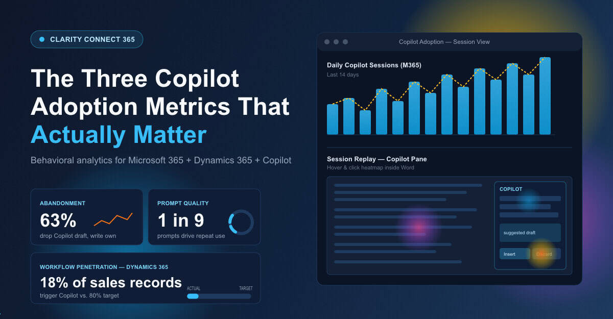
The gap between what Microsoft reports out of the box and what leadership actually needs to know is wider than most IT teams want to admit. Here are the three metrics that close it — and the reason your current dashboards probably aren't tracking any of them.
Microsoft's admin reports tell you a user invoked Copilot in Word. They do not tell you whether that user spent fourteen seconds with the suggested draft, scrapped it, rewrote the whole thing from scratch, and never opened the pane again that week. That is the single most important behavioral signal in a Copilot rollout, and it is invisible in every native Microsoft dashboard.
This matters because Copilot abandonment is the leading indicator of failed adoption. People do not announce that they have given up on a tool. They quietly stop using it. Then they tell their manager three months later that "Copilot doesn't really work for what I do." By that point, the license renewal conversation is already lost.
What you need is session-level visibility into the exact moment users open Copilot, what they ask, where they hesitate, and what they do next. Clarity Connect 365 captures that — session recordings inside the Copilot pane itself, across Microsoft 365 apps and the Copilot-enabled experiences your team has rolled out. You see the abandonment, not just the activation. And once you see it, you can actually do something about it.

Every Copilot rollout depends on prompt quality. Everyone running one will tell you this. Almost nobody is actually measuring it.
The honest truth about Copilot is that the gap between a great experience and a useless one is mostly a prompting problem. A salesperson who asks Copilot to "summarize this account" gets a generic summary. The same salesperson who asks Copilot to "draft a 90-day expansion plan for this account based on the last six months of meeting notes and the open opportunities in their record" gets something they can actually use. The first user concludes Copilot is mediocre. The second user becomes a champion.
Heatmaps and session replays inside Microsoft 365 and Dynamics 365 surface which prompt patterns produce real engagement — which queries lead to accepted suggestions, which lead to repeat use the next day, which get abandoned mid-typing. That is the data your enablement team needs to build training that actually changes behavior, rather than another generic deck about "ten ways to use Copilot."
If you cannot show leadership which prompts produced productive work and which ones produced confusion, you cannot prove Copilot ROI. You can only assert it.
Here is the metric nobody asks about, which matters more than any other: where in your business process should Copilot be showing up, and is it?
If your sales team is supposed to be using Copilot inside Dynamics 365 to draft proposal emails, you need to see whether they are actually opening Copilot from inside the opportunity record — or whether they are clicking out, going to a separate browser tab, doing it manually, and pasting the result back. If your finance team is supposed to be using Copilot in Excel to accelerate variance analysis, you need to see whether they touch the pane at all when they open a budget workbook.
This is where Microsoft's native reporting falls completely flat. It can tell you Copilot was used somewhere. It cannot tell you whether it was used where it was supposed to be used. That distinction is the entire ballgame for digital transformation leaders trying to demonstrate ROI on the platform investment.
Clarity Connect 365 was built for exactly this — extending Microsoft Clarity's heatmaps and session replays into internal Microsoft applications, including Dynamics 365, SharePoint, Power Platform apps, and the Copilot-enabled experiences across them. It is the only way to see, with no custom development, whether the workflows you designed your rollout around are actually happening in the wild.
One of our customers, a mid-market financial services firm, rolled out Microsoft 365 Copilot to 800 users last fall. Their admin reports said adoption was healthy — roughly 65% of licensed users active each month. Their executive sponsor was nervous anyway, because nobody could explain what those users were actually doing.
Three weeks after enabling Clarity Connect 365 across their Microsoft 365 environment, they had a completely different picture. Two-thirds of "active" users were opening Copilot once a day in Outlook, scanning the suggested draft, dismissing it, and writing the email themselves. A small minority — about 90 people — were using Copilot in Word and Excel in ways that were producing real time savings. The Dynamics 365 sales team, which the rollout had been pitched around, was barely touching Copilot inside CRM records at all.
That picture changed the entire enablement strategy. The training program got rebuilt around the actual behavior. The 90 power users became internal champions. The sales-in-CRM workflow got a redesign with embedded prompt guidance. Six months in, the adoption story is real, not asserted.
Microsoft's Copilot adoption reports are a starting point, not an ending point. They tell you the door is open. They do not tell you anyone walked through it, where they went once they did, or whether they came back. If your leadership is asking hard questions about Copilot ROI — and at this point in the cycle, every leadership team is asking them — you need behavioral data the admin center cannot give you.
The three metrics that matter are abandonment, prompt effectiveness, and workflow penetration. None of them appear in your native reports. All three are exactly what Clarity Connect 365 was built to surface, with no code, no custom development, and full enterprise-grade data masking. If you are going to defend the Copilot investment to a CFO who wants real answers, this is the data you need on the table.
See What's Actually Happening INSIDE Your Microsoft Apps
VisualSP accelerates digital adoption, digital transformation & user training.

Stop Pissing Off Your Software Users! There's a Better Way...
VisualSP makes in-app guidance simple.
